In occasion of 2023 Bologna Children’s Book Fair and in the framework of Aldus UP (co-funded by the Creative Europe Programme of the EU), Fondazione LIA organized the seminar Accessible illustrated books and where to find them, with the goal to present the opportunities and the challenges for the publishers producing complex layout books. The event provided a chance to listen to the experience of the Italian educational publisher Zanichelli and Iperborea’s The passenger, a series of illustrated books featuring investigative and literary reports and narrative essays that form a portrait of contemporary life in a country and its inhabitants.
It was the occasion also of showcasing one of the first examples at international level of experimentation of an accessible EPUB Fixed Layout, realized in collaboration with Edizioni Sonda. The prototype of the ebook was created according to the international guidelines of W3C (World Wide Web Consortium) and it is the result of the ongoing research and development activities done by LIA on how to make digital books accessible to all readers, regardless of their physical or cognitive abilities.
Accesible fixed layout EPUB
When we talk about EPUB accessibility, we do usually refer to reflowable EPUBs, for which there are already guidelines defining the accessibility conformity requirements. Talking about fixed layout EPUBs, instead, we refer to a particular kind of digital publication mostly suitable for ebooks with a complex layout. These formats are often used in specific publishing sectors, such as children’s books or comics and, in some cases, textbooks and non-fiction, as travel guides and recipe books, where the layout drives information to the user. FXL EPUBs can be made in two different ways: SVG or HTML + CSS (sometimes also using JPG or PNG images as pages). They are EPUB 3 files that have been created to replicate the layout of the printed version of the book:
- The size of the live page is set as fixed – it will always be displayed as a certain number of pixels wide and a certain number of pixels high, no matter the screen it is displayed on;
- Font and text size are defined by content creators and cannot be changed by users, so that text is displayed (more or less) as designed, regardless of platform or user preference; this does not allow an adequate customization level and therefore it is less suitable for users with low vision;
- The User Experience is similar to PDFs as it is not responsive.
Within W3C since 2021 there is a dedicated task force, an international working group composed of accessibility and digital publishing experts to study how to make fixed layout (FXL) EPUBs more accessible. One of the task force’s main objectives has been to produce guidelines that can be used by content creators to make accessible FXL EPUBs.
Fondazione LIA research project
In 2022 Edizioni Sonda, a member of Fondazione LIA, asked for support in the creation of the accessible digital version of E tu cos’hai di speciale, a children’s book by Horst Klein and Monika Osberghaus focused on inclusion. Even if children’s books (and FXL ebooks) are one of the categories of books that for the European Accessiblity Act are not required to be fully accessible but to be created as accessible only at the state of the art, LIA and Sonda decided to join forces to understand if it was possible to achieve accessible results nevertheless, with the goal to provide the best reading experience possible to all the readers.
From the very first analysis, it was clear that transforming the book into a reflowable digital version would have impacted usability as the layout itself carries meaning. Thus, LIA proposed to work together to produce an accessible EPUB Fixed Layout.
The project presented numerous challenges that needed to be tackled:
- the identification of the reading order
- efficient alternative description of images
- enriched semantics
- readability
- colour contrast
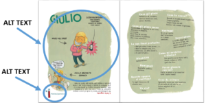 “E tu cos’hai di speciale” © Edizioni Sonda
For this project LIA paid particular attention to the editorial work of drafting the alternative descriptions of the images and the graphic work on colours contrast, in order to make the contents and messages conveyed by illustrations understandable to all.
As for image description, LIA worked side by side with the publisher to ensure that the tone of voice and the words chosen were in line with the publishers’ and that all relevant information within each page were conveyed through the alt texts.
The colour analysis allowed LIA to identify colour contrasts that were not accessible in the first place and identify accessible solutions, in accordance with the publisher.
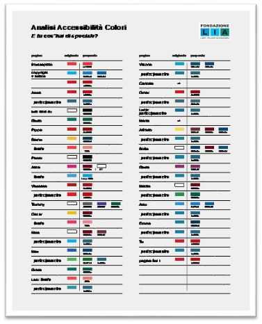
After working on the content, we moved on to work on the Adobe InDesign page layout software, which is the software that was used to create the print edition of the book. Here LIA focused the work on four main elements:
- Identification of semantic elements through the use of paragraphs and character styles: so you can distinguish not only visually, but also at the code level a title, from the main text, the table of contents, etc.;
- Assigning the correct language to the different portions of text: the text was in Italian, but some words were in English, or German;
- Inserting alternate text for images;
- Adaptation of colours in the layout to meet accessibility criteria regarding colour contrast.
After doing this work, we realized InDesign does not support the export of semantic tags for EPUB FXL (as it is supported for the export of reflowable EPUBs instead), so we worked with “semantic” CSS classes and set up automatic transformations to turn a non-semantic element, into a semantic element:
<p class=”h1″>Title</p> → <h1>Title</h1>
We’ve also found that InDesign places each word in a <span> element positioned absolutely on the page. The use of many spans makes reading with screen readers not smooth, so we set up an automatic transformation to merge successive span elements and remove absolute positioning references
<span style=”top:10px; left:50px”>First</span> <span style=”top:10px; left:100px”>sentence</span> → <span>First sentence</span>
The results
The result was an accessible Fixed Layout EPUB that passes EPUBCheck and Ace by DAISY checks and meets the requirements of Web Content Accessibility Guidelines 2.1 level AA. We tested it with some user with disabilities that told us that the file provides a better user experience than an accessible PDF.
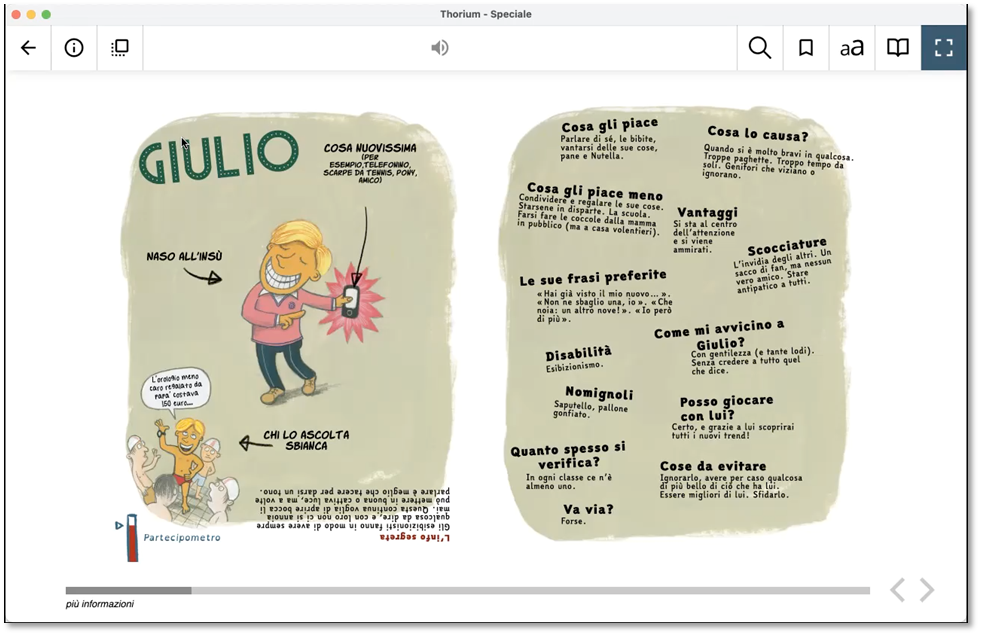 “E tu cos’hai di speciale” © Edizioni Sonda
Reflowable EPUBs are overall preferable, because they better adapt to the reading needs of users with low vision (enlarging text, changing colours, etc.). The experiment showed that whenever a reflowable EPUB is not feasible, creating a FXL ebook can bring a good level of accessibility especially for those books that are now required to be accessible at the state of the arts.
For the sake of completeness, it is worth adding that one of the additional accessibility requirements related to ebooks set in Session VI of the European Accessibility Act requires ebooks to include dynamic layout and allow flexibility and choice in the presentation of the content; this is not fully fulfilled in the experimentation.
«As Fondazione LIA we are convinced that this prototype represents a major step towards the accessibility of digital books for all and we are very happy that Edizioni Sonda involved us in this project» commented Gregorio Pellegrino, Chief Accessibility Officer of Fondazione LIA, in charge of the project.
«The 25 stories contained in this book serve as a reminder that, despite our differences, every individual has the right to be who they are. We are glad that, thanks to the collaboration with LIA, girls and boys can browse and read this ebook that means so much to us» declares Antonio Monaco, publisher of Edizioni Sonda.
The ebook will be soon available in online stores and on LIA catalogue of accessible ebooks:
www.catalogo.fondazionelia.org
This article was originally published on the website of Fondazione Lia.
 By
By 


